Loading.....
 Back to blog

BEM: A Comprehensive Guide to Better CSS Architecture

In the ever-evolving landscape of web development, maintaining scalable, maintainable, and modular CSS becomes paramount. One approach that has gained substantial traction in recent years is BEM, which stands for Block, Element, Modifier. BEM is a methodology for naming CSS classes in a way that promotes code reusability, readability, and maintainability. In this comprehensive guide, I will be sharing the intricacies of BEM, its benefits, best practices, and how you can leverage it to improve your CSS architecture.
Understanding BEM
Understanding BEM (Block Element Modifier) is pivotal for efficient and structured web development. BEM is a methodology that promotes organized and maintainable CSS, ensuring that your codebase remains clean and scalable. It encourages developers to create self-contained and reusable components, making collaboration and code management more straightforward.
Mastering BEM equips web developers with a powerful tool to craft websites that are not only visually appealing but also highly maintainable and adaptable to evolving project requirements.
Breaking Down the Abbreviation
1. Block:
A block is a standalone component that is meaningful on its own. It represents a higher-level component of the interface, like a navigation bar, a button, or a form field.
2. Element:
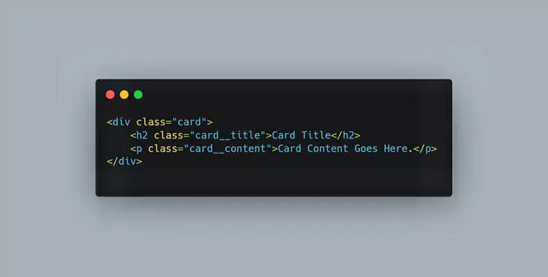
An element is a part of a block that has no standalone meaning and is semantically tied to its block. For example, in a block representing a card component, elements could be the card's title, image, and content.
3. Modifier:
A modifier is a flag on a block or element, used to change its appearance or behavior. Modifiers allow you to create variations of blocks or elements without altering their base structure. For instance, a button block could have modifiers for different colors or sizes.
The Benefits of BEM

1. Readability and Maintainability:
BEM's clear naming convention enhances code readability, making it easier for developers to understand the structure and purpose of each class. This transparency facilitates collaboration among team members and simplifies maintenance tasks.
2. Scalability:
BEM scales well with large codebases. By encapsulating styles within blocks and ensuring a clear hierarchy, it becomes simpler to manage CSS rules across the entire project. This scalability is especially crucial in complex web applications.
3. Reusability:
BEM promotes the creation of reusable components. Once defined, a block or element can be reused in various parts of the project, ensuring consistent styling and behavior. This reusability reduces redundancy and promotes a DRY (Don't Repeat Yourself) approach to CSS.
4. Collaboration:
With its standardized naming conventions, BEM fosters collaboration among developers. It establishes a common language, enabling team members to quickly grasp the purpose and structure of various components within the project.
Implementing BEM in Your Projects
1. HTML Structure:
In your HTML, apply BEM classes to the respective elements. For example, for a card component with a title and content:
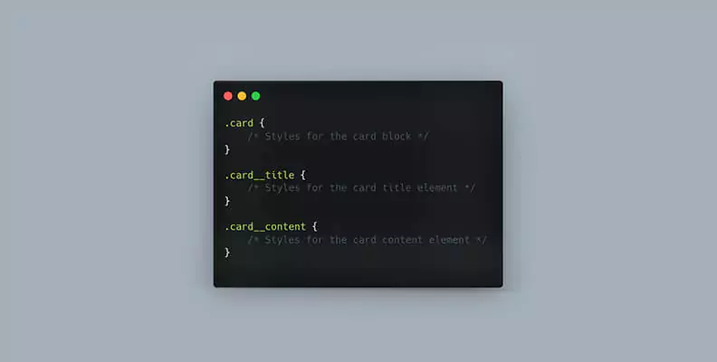
2. CSS Styling:
Corresponding styles can be written using the BEM class names:
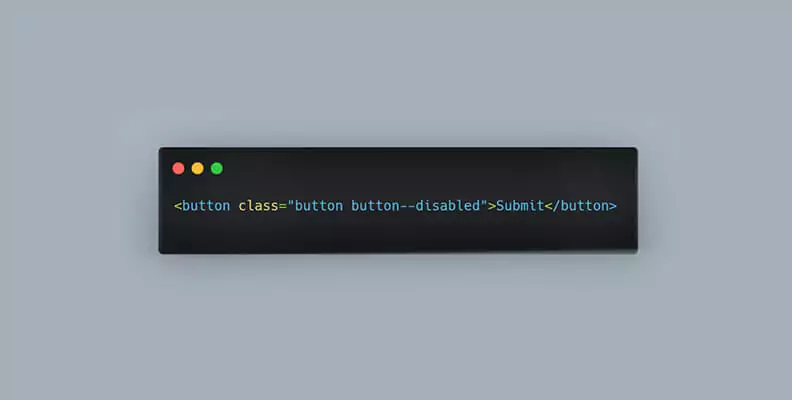
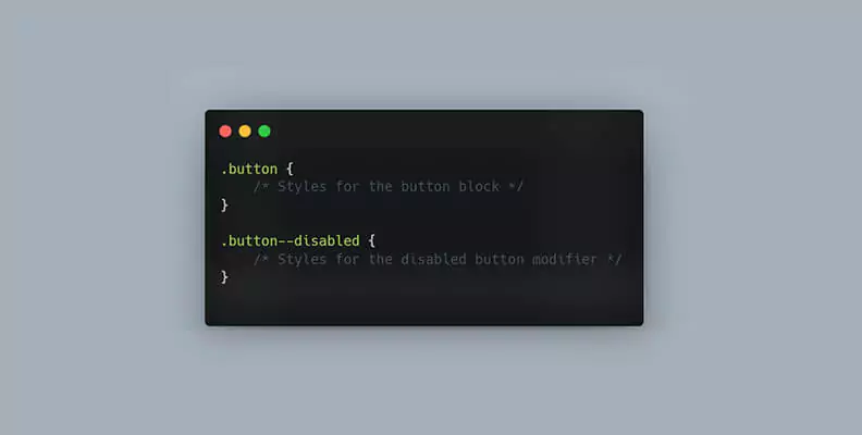
3. Modifiers:
For modifiers, add an extra class indicating the modification. For example, a disabled button:
Best Practices for Implementing BEM
1. Meaningful Names:
Choose descriptive and meaningful names for blocks, elements, and modifiers. Names should reflect the purpose and function of the component to enhance understanding.
2. Avoid Nesting:
While it's tempting to nest selectors in CSS, BEM discourages this practice. Instead, keep your CSS flat, ensuring that the BEM classes remain independent of the DOM structure. This promotes modularity and prevents unintended style overrides.
3. Maintain Consistency:
Establish consistent naming conventions across your project. Consistency ensures that anyone working on the project can quickly understand the structure of the codebase, leading to faster development and fewer errors.
4. Responsiveness and Modifiers:
Use modifiers judiciously for responsive design. Modifiers can represent different states of a component, such as active, disabled, or responsive variations. By using modifiers, you can maintain the integrity of the block or element while altering its appearance based on specific conditions.
Conclusion
BEM provides a structured, systematic approach to CSS architecture, enhancing collaboration, readability, and maintainability within web development projects. By following the BEM methodology and adhering to best practices, you can create cleaner, more efficient, and maintainable stylesheets.
As you incorporate BEM into your projects, remember that consistency is key. Consistent naming conventions, meaningful class names, and the judicious use of modifiers will empower your team to work cohesively, leading to more efficient development cycles and a more robust codebase.
In the ever-changing landscape of web development, adopting methodologies like BEM ensures that your CSS remains robust and adaptable, setting the stage for dynamic, responsive, and visually appealing web applications. So, embrace BEM, and let your CSS codebase flourish with clarity and efficiency. Happy coding!


Menu
Contact Us


