Loading.....
 Back to blog

Decoding the Art of Typography in Web Design
In the vast landscape of web design, every element plays a crucial role in creating a seamless and engaging user experience. One such element that often takes center stage but is frequently underestimated is typography. Typography goes beyond just choosing fonts; it encompasses the art and science of arranging text to make it not only readable but also visually appealing. In this guide, we will delve into the fundamentals of typography in web design, exploring key concepts, best practices, and tips to enhance your website's visual appeal and readability.
Understanding Typography
Typography is more than just choosing fonts for your website; it's the art and technique of arranging type to make written language legible, readable, and appealing. Key elements include fonts, typefaces, font families, font styles, and font sizes. It directly influences how users perceive and interact with content. Consider the following reasons why typography is a critical aspect of web design:
- First Impressions: Typography is often the first visual element users encounter on a website. The right font choice can set the tone for the entire site, conveying professionalism, creativity, or a specific mood.
- Readability and Accessibility: Clear and legible typography ensures that users can easily consume the content. Accessibility is a key consideration, as text should be readable across various devices and for users with different abilities.
- Branding and Consistency: Typography contributes to brand identity. Consistent use of fonts across all communication channels reinforces brand recognition and creates a cohesive and trustworthy image.
- User Engagement: Well-designed typography enhances the overall user experience, making it more enjoyable and encouraging users to spend more time on the site. This, in turn, can reduce bounce rates and increase conversion rates.
Typography Principles in Web Design
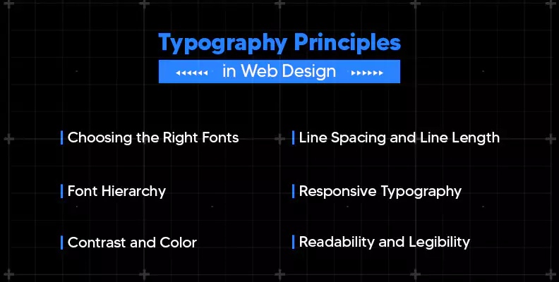
Choosing the Right Fonts
Selecting the right fonts for your website is a critical step in creating a visually pleasing design. Consider the tone and purpose of your website. Serif fonts convey a traditional and formal feel, while sans-serif fonts are modern and sleek. Combining fonts can add variety, but it's crucial to maintain readability. Google Fonts and Adobe Fonts offer a wide range of free and paid font options for web use.
Font Hierarchy
Establishing a clear font hierarchy ensures that your content is easily scannable and digestible for users. Use different font sizes, weights, and styles to create a visual hierarchy that guides readers through the content. Headers should be larger and bolder than body text, making it easy for users to identify and navigate through different sections.
Line Spacing and Line Length
Proper line spacing and line length contribute to the overall readability of your website. Adequate line spacing prevents text from feeling cramped, while appropriate line length ensures that users can comfortably read content without straining their eyes. Aim for a line length of 50-75 characters per line for optimal readability.
Responsive Typography
With the increasing use of mobile devices, it's crucial to implement responsive typography. Use relative units like percentages or ems instead of fixed units like pixels for font sizes. This ensures that your typography adjusts appropriately to different screen sizes, providing a consistent and enjoyable reading experience across devices.
Contrast and Color
Typography isn't just about black text on a white background. Consider contrast and color to create visually appealing designs. High contrast between text and background improves readability, while using color strategically can draw attention to key elements. Ensure that your color choices align with your brand and the overall aesthetic of your website.
Readability and Legibility
Prioritize readability and legibility to enhance the user experience. Readability refers to how easily users can comprehend the text, while legibility focuses on how easily users can recognize individual characters. Choose fonts with clear letterforms and pay attention to factors like font size, line spacing, and contrast to optimize both readability and legibility.
Best Practices for Typography
The art of choosing and arranging fonts goes beyond aesthetics; it significantly impacts user experience and readability. To ensure your website stands out and engages visitors effectively, here are some best practices for typography in web design
- Prioritize Readability: The primary purpose of text on a website is to convey information. Hence, prioritizing readability is paramount. Opt for clean and legible fonts, ensuring that the text is easily comprehensible across various devices and screen sizes. Sans-serif fonts, such as Arial or Helvetica, are commonly preferred for their simplicity and clarity.
- Maintain Consistency: Consistency in typography across your website fosters a cohesive and professional appearance. Establish a consistent hierarchy for headings, subheadings, and body text. Use a limited number of fonts to maintain a unified design, and ensure that font sizes and styles are standardized throughout the site.
- Mindful Font Pairing: While variety can be engaging, it's crucial to pair fonts thoughtfully. Combining fonts that complement each other enhances visual interest without sacrificing readability. Choose fonts with contrasting styles (serif with sans-serif, for example) to create a harmonious and balanced design.
- Whitespace Matters: Adequate whitespace around text elements contributes to a cleaner and more digestible design. Pay attention to line spacing, margins, and padding to prevent overcrowding. Ample whitespace not only enhances readability but also improves overall aesthetics.
- Contrast for Emphasis: Utilize font weight, size, and color to create contrast and emphasize key elements. Important headings can be bold and larger, while subheadings and body text can be lighter. However, maintain a balance to avoid overwhelming the reader.
- Limit Font Styles: While variety can be engaging, using too many font styles can create visual chaos. Stick to a limited set of fonts to maintain a cohesive look and feel. Typically, a combination of a sans-serif font for body text and a serif font for headings works well.
Conclusion
Typography is a powerful tool in web design, influencing how users perceive and interact with your website. By understanding the fundamentals of typography, choosing the right fonts, establishing a clear hierarchy, and considering factors like line spacing and color, you can create visually appealing and user-friendly websites. Implement these tips in your web design journey to enhance the overall aesthetic and readability of your digital creations.


Menu
Contact Us


