Loading.....
 Back to blog

Impact of Color Theory in Graphics
Creating a color palette is something graphic designers always do when they're making a new brand. I remember the first time I worked on a branding project, it was my very first one. I had to make a bunch of things like keywords, mood boards, logos, mockups, and, of course, a color palette.
Back then, I wasn't sure how a color palette should work. I thought I just needed to put all the colors that the brand would use into it. So, I picked colors that I liked and put them in the palette without much thought. But it left me wondering if there were any rules or a system for this. It felt like the only guideline was whether the colors looked good together. As I kept learning about design, I noticed some job listings from companies that wanted designers to know about "color theory." That got me curious, and I decided to explore the questions I had about color theory.
In simpler words, color theory is like a toolbox for designers. It gives us the knowledge and tools to choose colors that not only look good but also convey the right message and feelings. As I kept digging into color theory, I realized it's a crucial part of being a graphic designer. It's like having a roadmap for picking the perfect colors that make our designs both attractive and meaningful. In this blog, we'll break down color theory, so you can learn how to use it to make your design work even better. So, keep reading as we start this colorful journey together!
What is Color Theory in Graphic Design
Color theory in graphic design is a fundamental and indispensable aspect of visual communication. It refers to the principles and guidelines that govern the use of colors in design to create visually appealing and effective artwork. Understanding color theory is crucial for designers as it can significantly impact the overall perception, mood, and message of a design.
One of the core components of color theory is the color wheel, which consists of primary, secondary, and tertiary colors. Beyond the color wheel, color theory encompasses various color schemes, including complementary, analogous, and triadic combinations. Designers use these schemes to create harmonious and visually pleasing compositions.

Color theory also explores aspects like hue, saturation, and brightness, which determine the intensity and vibrancy of colors. Designers manipulate these attributes to convey specific emotions or messages, making color an essential tool for branding and marketing.
Unveiling the Power of Color Psychology
Before we dive into the impact of color theory in graphic design and understand that colors have inherent psychological associations. Each color has a unique ability to elicit emotions and set the tone for a design. Here are a few examples:
- Red: The color of passion and urgency, ideal for call-to-action elements.
- Blue: Symbolizes trust and professionalism, often used by tech companies.
- Yellow: Exudes positivity and cheerfulness, great for friendly brands.
- Green: Represents growth and health, perfect for eco-friendly brands.
- Purple: Evokes luxury and creativity, adding elegance to designs.
Understanding these psychological associations is essential for designers. It allows them to intentionally use color to communicate a specific message or mood.
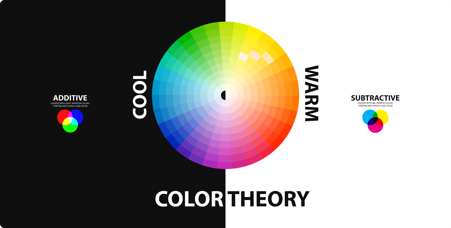
The Modern Color Wheel
A color wheel is a circular chart that displays the relationships between colors. It's a visual tool used in art, design, and color theory to understand how colors relate to one another and how they can be combined harmoniously. Today, the color wheel typically consists of 12 colors arranged in a circle. These colors are divided into three categories:
- Primary Colors: Red, blue, and yellow are considered the primary colors. They cannot be created by mixing other colors and are the foundation for all other colors.
- Secondary Colors: Secondary colors are produced by mixing equal parts of two primary colors. They include green (blue + yellow), orange (red + yellow), and purple (red + blue).
- Tertiary Colors: Tertiary colors are created by mixing a primary color with a neighboring secondary color. This results in colors like red-orange, blue-green, and yellow-purple.
Unlocking the Art of Color Harmony and Contrast
In the world of design, color is much more than just a visual element. It's a powerful tool that can influence emotions, communicate messages, and create a lasting impact. The two key principles that govern the art of color manipulation in design are color harmony and contrast. These principles can elevate your designs from mundane to magnificent. So, let's delve into the fascinating world of color and explore how mastering color harmony and contrast can transform your design work.
Color Harmony
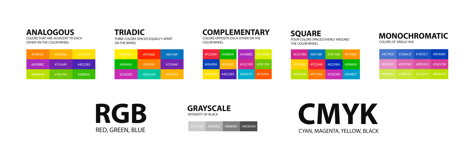
Color harmony involves crafting a visually pleasing and balanced experience by arranging colors in a way that feels coherent. Here are some popular types:
- Complementary Harmony: This pairs colors opposite each other on the color wheel (e.g., red and green). It creates a strong contrast and makes elements stand out.
- Analogous Harmony: This involves using colors next to each other on the wheel (e.g., red, orange, and yellow), creating a warm, unified look.
- Triadic Harmony: Triadic harmony uses three evenly spaced colors on the wheel, offering a balanced blend of contrast and harmony.
- Monochromatic Harmony: This uses variations of a single color for a sophisticated, unified appearance.
Color Contrast
Color contrast, on the other hand, emphasizes the principles of light and dark, warm and cool, and complementary colors to make specific elements stand out. There are three main types:
- Value Contrast: Focuses on the difference between light and dark colors, with high contrast for a dramatic effect and low contrast for a subtle look.
- Color Temperature Contrast: It's all about warm colors contrasting with cool ones to set the mood; warm colors energize, while cool colors offer calm.
- Complementary Color Contrast: Opposite colors on the wheel, like red and green, create intense contrast and make elements pop when used strategically.
Conclusion
In conclusion, we've embarked on a journey to explore the profound impact of color theory in graphic design, shedding light on its game-changing effects. We began by delving into the intricate world of color psychology, uncovering how each hue possesses a unique ability to evoke emotions and set the tone for a design.
Next, we introduced the modern color wheel, a timeless tool that serves as our guide through the realm of colors. The color wheel helps us understand the relationships between primary, secondary, and tertiary colors, enabling us to create stunning palettes that convey the intended message.
Our exploration wouldn't be complete without unraveling the art of color harmony and contrast. We learned that these principles are the keys to transforming ordinary designs into extraordinary works of art. Color harmony empowers us to select and arrange colors in a way that feels balanced and visually appealing, while contrast allows us to make certain elements stand out, drawing the viewer's attention to key focal points and adding depth to our creations.
In the world of graphic design, color theory is more than just aesthetics; it's a language through which we communicate, invoke emotions, and shape perceptions. Understanding the intricate interplay of color psychology, the modern color wheel, and the principles of harmony and contrast opens up endless possibilities for designers to make a lasting impact. Armed with this knowledge, designers have the tools to create designs that not only catch the eye but also convey a deeper message. It's a game-changer that elevates graphic design to an art form with boundless potential, where the canvas is the screen, and the palette is a spectrum of colors limited only by our imagination. So, as you embark on your next design journey, remember the transformative power of color theory, and let it be your guiding light in the ever-evolving world of graphic design.


Menu
Contact Us


