Loading.....
 Back to blog

Mastering Design Systems: Revolutionizing Digital Interfaces

In the ever-evolving landscape of design and development, the concept of a design system has become a cornerstone for creating cohesive, user-friendly, and visually stunning experiences. A design system is more than just a collection of components and guidelines; it’s a dynamic framework that streamlines the creative process, fosters collaboration, and ensures consistency across various digital platforms. In this blog post, we’ll dive into the world of design systems, exploring their benefits, key components, and how they contribute to the success of digital projects.
What Is a Design System
A Design System is a cohesive collection of reusable components, governed by clear standards, used to maintain consistency and efficiency across digital interfaces. It serves as the blueprint for product development, combining design, functionality, and best practices into a single, comprehensive framework. This system is not merely a static set of guidelines; it’s a living ecosystem that evolves with technology, trends, and user needs.
Components of a Design System
The components of a Design System are integral elements that collectively establish a framework for creating consistent and efficient designs across various platforms and products. Here’s a detailed breakdown:
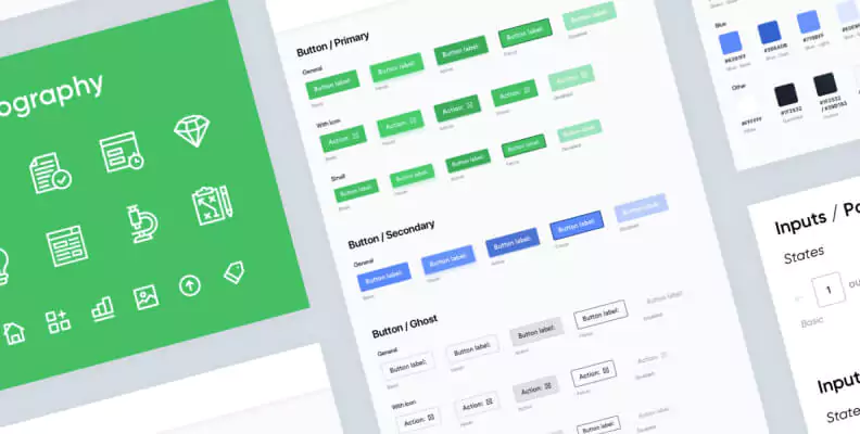
Style Guide
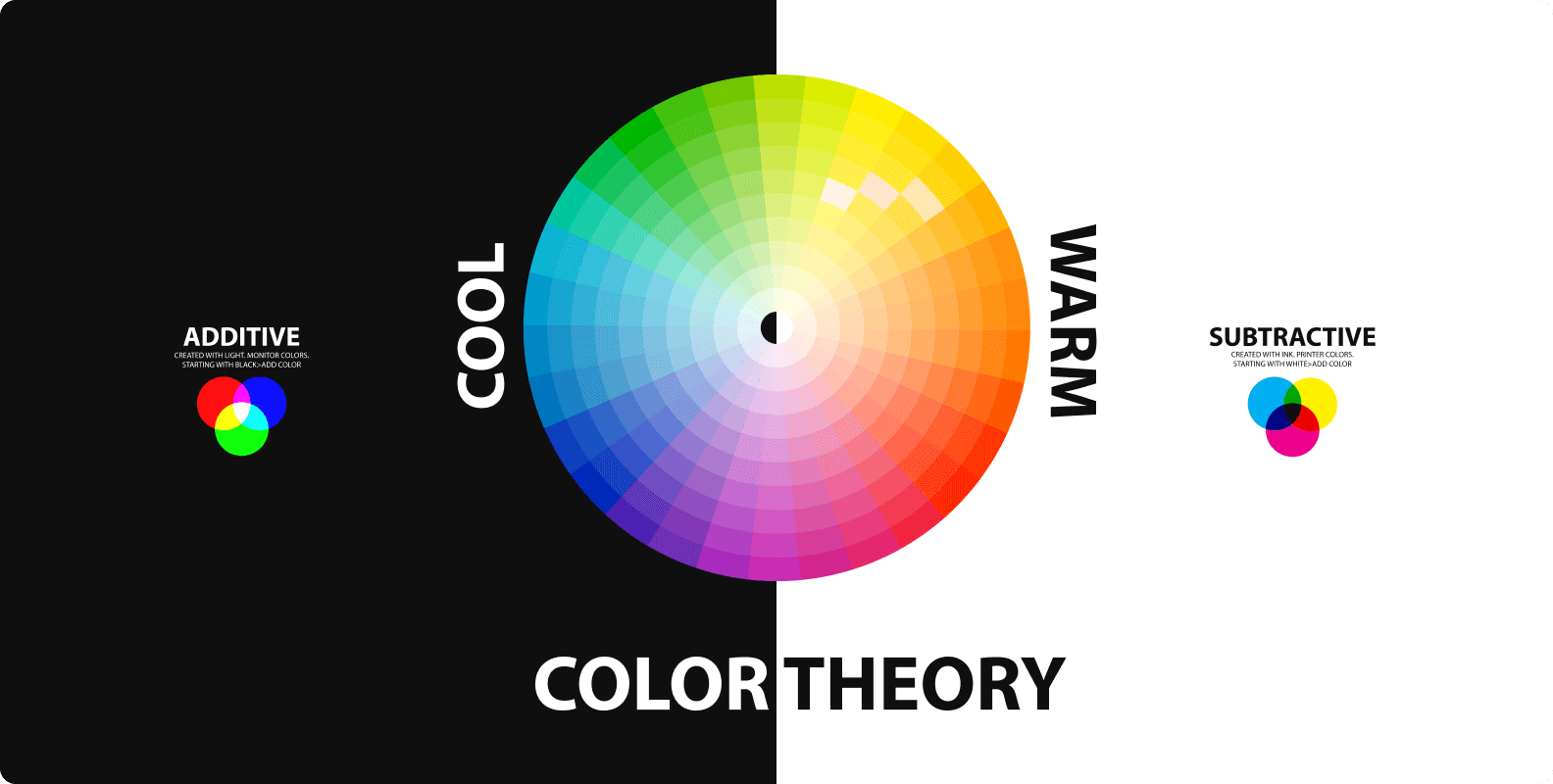
Color Palette: Defines the primary and secondary colors, along with shades for UI elements, text, and backgrounds.
Typography: Outlines typefaces, font weights, and styles, ensuring text is both readable and aesthetically aligned with the brand.
Iconography: Specifies the style, size, and usage rules for icons to ensure they are consistent and understandable.
Imagery: Guidelines for image styles, such as illustrations and photography, including how and where to use them.
UI Components
Buttons and Inputs: Styles for buttons, text fields, checkboxes, radio buttons, switches, and dropdown menus.
Navigation Elements: Design of menus, tabs, pagination, and breadcrumbs.
Information Components: Includes cards, lists, tooltips, alerts, and progress bars.
Layout Principles: Guidelines for grids, spacing, alignment, and responsive design strategies.
Design Patterns and Practices
Interaction Design: Standardized behaviors for common interactions like hovering, clicking, scrolling, and swiping.
User Flows: Best practices for common workflows, like user registration, checkout processes, or search functionality.
Accessibility Guidelines: Ensuring the design is usable by people with various disabilities.
Documentation
Component Usage: Instructions on how and when to use different UI components.
Design Principles: Fundamental ideas and values that guide the design decisions within the system.
Coding Guidelines: For developers, ensuring the accurate implementation of the designs in code.
Design Tools and Resources
Templates and Sketch Files: Pre-designed templates and sketch files for quick and consistent design creation.
Asset Libraries: Collections of reusable design assets like components, icons, and images.
Front-end Code Snippets: Pre-written HTML/CSS/JavaScript for UI components to ensure consistency between design and development.
Component Libraries: In the case of web frameworks like React or Angular, this includes ready-to-use coded components.
Benefits of Design System
Design Systems offer a multitude of benefits that streamline and enhance the process of designing and developing digital products. Here are some key advantages:
- Enhanced Consistency and Cohesion: Design Systems establish a unified set of design rules and components, ensuring consistency across all digital platforms and products. This uniformity enhances brand recognition and provides users with a familiar and intuitive experience, regardless of where they interact with the brand.
- Improved Efficiency and Speed: By providing a library of pre-designed elements and patterns, Design Systems reduce the time needed to design from scratch. Designers and developers can quickly assemble pages and features using these reusable components, accelerating the development process and enabling faster go-to-market for new features and products.
- Easier Collaboration and Communication: Design Systems act as a common language between designers, developers, and stakeholders. They streamline collaboration by reducing misunderstandings and ensuring everyone is on the same page. This clarity improves teamwork and facilitates a smoother product development process.
- Scalability: As businesses grow, their products and services often need to expand and evolve. Design Systems are built to be scalable, making it easier to add new components and styles without disrupting existing designs. This scalability ensures that the design can grow in tandem with the company.
- Enhanced User Experience: A consistent and familiar design language makes it easier for users to understand and interact with your product. This familiarity reduces the learning curve for new users and enhances overall user satisfaction.
- Faster Decision Making: Design Systems provide clear guidelines and best practices, which can speed up decision-making processes. Designers and developers don’t have to debate over design choices, as the Design System offers defined rules to follow.
- Future Proofing: As technologies and trends evolve, Design Systems can be updated to adapt to these changes. This makes it easier to keep products and services modern and relevant, without needing to overhaul the entire design.
Implementing a Design System
Implementing a Design System is a transformative journey that can streamline your design and development process, ensuring consistency and efficiency. However, it requires careful planning and a strategic execution. This guide will walk you through the critical steps for successfully implementing a Design System in your organization.
Assess Your Needs and Set Clear Goals
Start by assessing the current state of your design and development processes. Identify pain points, inconsistencies, and inefficiencies. Set clear, achievable goals for what you want the Design System to accomplish, such as reducing design time, ensuring brand consistency, or improving user experience.
Assemble a Cross-Functional Team
Create a dedicated team responsible for the development and maintenance of the Design System. This team should include designers, developers, content strategists, and project managers. Having a diverse group ensures that the system is practical and applicable across different aspects of your projects.
Start Small and Scale
Begin with a small, manageable scope. Focus on the most commonly used components and styles. Gradually expand the Design System, adding more elements and guidelines as it proves its effectiveness and as your team becomes more accustomed to using it.
Develop with Reusability in Mind
Design and code components with reusability and adaptability in mind. This ensures that they can be easily modified and applied across various projects and platforms.
Ensure Thorough Documentation
Documentation is critical for the successful adoption of a Design System. It should clearly explain how and when to use each component, as well as the underlying design principles. Good documentation helps new and existing team members to use the system effectively.
Provide Training and Resources
Conduct workshops and training sessions to familiarize your team with the Design System. Provide resources and ongoing support to help them transition to this new way of working.
Tips for Creating Design System
Creating a Design System can be a challenging yet rewarding endeavor. It requires a strategic approach to ensure that the system is practical, scalable, and effectively adopted by your team. Here are some essential tips to consider when creating a Design System:
Understand Your Audience and Context
Begin by understanding the needs of your designers, developers, and end-users. Tailor your Design System to address these specific requirements and contexts.
Analyze existing products and identify common patterns and inconsistencies. This will help in creating a system that is immediately beneficial.
Start Small and Build Gradually
Avoid trying to create a comprehensive system all at once. Start with the most critical components and expand over time
Focus on creating a few highly versatile and reusable elements first. This helps in gaining quick adoption and demonstrates the value of the system early on.
Emphasize Reusability and Consistency
Design components and patterns with reusability in mind. This increases efficiency and ensures consistency across different projects and platforms.
Standardize UI components, color palettes, typography, and other design elements to maintain a cohesive look and feel.
Ensure Scalability
Design the system to be scalable and flexible. It should be able to evolve and accommodate future design needs and technologies.
Keep the architecture of the Design System modular, allowing for easy updates and additions.
Collaborate Across Disciplines
Foster a collaborative environment where designers and developers can work together. This ensures that the Design System is feasible both in design and implementation.
Regularly review the system together to ensure it meets both design and technical requirements.
Prioritize Comprehensive Documentation
Detailed documentation is key to a successful Design System. It should clearly explain the usage, principles, and guidelines of the system.
Include examples and best practices to make the documentation more actionable and user-friendly.
Educate and Train Your Team
Provide training sessions and resources to help your team understand and effectively use the Design System.
Encourage a culture of continuous learning and experimentation within the system.
Promote and Advocate for the System
Actively promote the use of the Design System within your organization.
Share success stories and benefits regularly to keep the team motivated and committed to the system.
Review and Evolve
Periodically review the Design System to ensure it remains relevant and effective.
Be open to evolving the system as new design trends and technologies emerge.
Examples of Design System
Design Systems have become integral to many organizations, aiding in the creation of consistent and efficient user experiences. Here are some notable examples of Design Systems from various companies, each with its unique strengths and approaches:
Google’s Material Design
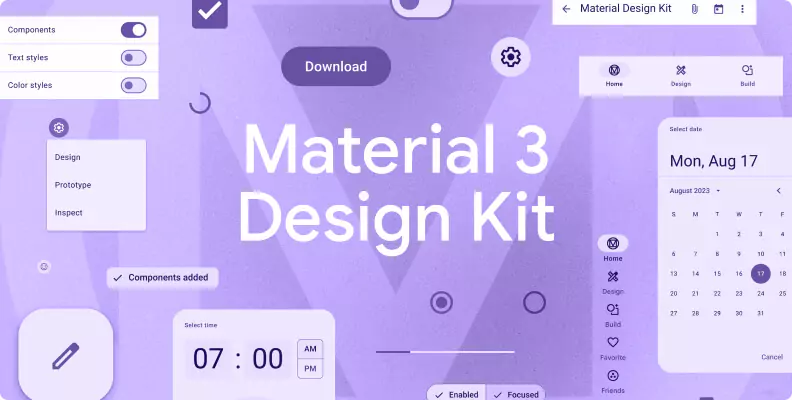
Perhaps the most well-known Design System, Material Design was introduced by Google in 2014.
It’s an adaptable system grounded in tactile reality, inspired by paper and ink, and is open to innovation.
Material Design is known for its use of grid-based layouts, responsive animations and transitions, padding, and depth effects like lighting and shadows.
Apple’s Human Interface Guidelines

Apple’s Design System focuses on ensuring a consistent and intuitive user experience across all Apple devices.
It provides comprehensive guidelines for designing for iOS, iPadOS, macOS, watchOS, and tvOS.
The system emphasizes clarity, deference, and depth in its design approac
IBM’s Carbon Design System

Carbon is IBM’s open-source Design System for products and digital experiences.
With a focus on efficiency and accessibility, it provides a series of reusable components and patterns.
Carbon is well-regarded for its detailed documentation and for facilitating the implementation of IBM’s design language.
Atlassian’s Design System

Known for software like Jira and Confluence, Atlassian’s Design System offers guidelines, resources, and tools to create a cohesive experience across all Atlassian products.
It’s characterized by its simplicity, focus on teamwork and collaboration, and an emphasis on creating user-centric experiences.
Adobe’s Spectrum

Spectrum is Adobe’s Design System, focused on providing a cohesive experience across its vast array of creative software.
It’s known for its attention to visual aesthetics, taking into account the needs of creative professionals who use Adobe’s products.
Conclusion
In a world where digital experiences play a crucial role in user engagement, a well-implemented design system can be a game-changer. It not only enhances the visual appeal of a product but also fosters collaboration, efficiency, and scalability. As designers and developers continue to push the boundaries of creativity, a solid design system stands as a reliable guide, ensuring that every pixel contributes to a seamless and delightful user experience. Embrace the power of design systems, and witness the transformation of your digital projects into harmonious and captivating creations.


Menu
Contact Us


