Loading.....
 Back to blog

Top 10 Optimal Strategies For Responsive Website Designs
Responsive web design is essential in today's digital environment, where users access websites from a variety of devices, from desktop computers to smartphones and tablets. Designing a responsive website designs ensures it looks and functions optimally on all screen sizes, increasing user satisfaction and engagement. Let’s explore the best practices for creating responsive web design that offers a seamless user experience.

- Understand Your Audience
- Use CSS Media Queries
- Implement Mobile Access
-
Viewport Meta Tag:
Add the viewport meta tag in the
<head>section of your HTML to ensure the proper scaling and sizing of your website on mobile devices. -
Test on Real Devices:
Test your website on various real mobile devices to ensure it functions correctly and looks good on different screens.
- Touch-Friendly Elements:
- Image and Multimedia Optimization
- Compress Images:
- Leverage Responsive Images:
- Lazy Loading:
- Use External Hosting:
- Use Flexible Grid Systems
- Prioritize Content And Features
- Collapsible Sections:
- Optimize Call-to-Action (CTA) Buttons:
- Extensive Testing
- Device Testing:
- Browser Testing:
- Cross-Platform Testing:
- Apply Performance Optimization Techniques
- Minimize HTTP Requests:
- Browser Caching:
- Compress Resources:
- Maintain Consistent Branding And User Interface Design
- Use a Design Tool:
- Color Consistency:
- Typography Consistency:
- Accessibility Considerations
- Familiarize Yourself with WCAG:
- Semantic HTML:
- Alt Text for Images:
Before diving into the technical aspects of responsive website designs, it's important to understand your target audience and their device usage patterns. Knowing the devices they mostly use will help you tailor your design and prioritize optimization accordingly.
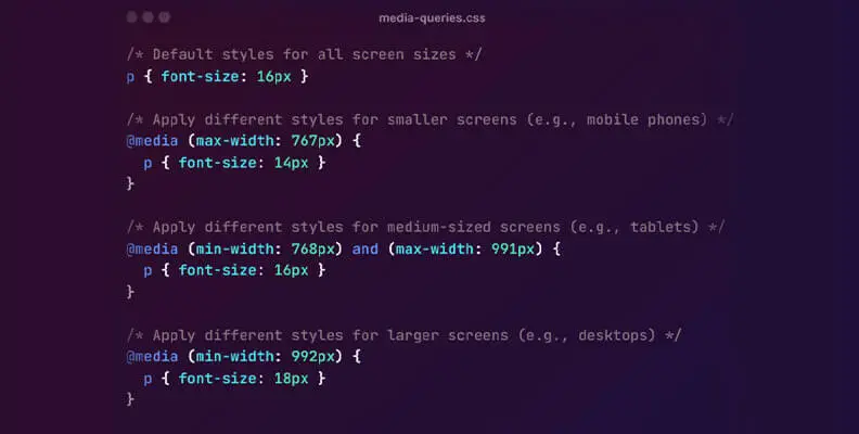
CSS media queries are a fundamental technique in responsive website designs. They allow you to apply specific styles based on device characteristics such as screen width, height, or orientation. Use media queries to adjust layouts, fonts, and other design elements for different screen sizes.
Start designing and developing for the smallest screen sizes first, then gradually improve the layout for larger screens. This approach ensures that your website's core content and functionality is accessible on smaller devices, providing a better mobile user experience.

Make sure all interactive elements (buttons, links, etc.) are large enough and have enough spacing to be easily tapped on touchscreens.
Large images and videos can significantly slow down the loading of your website, especially on mobile devices. Use responsive images and consider lazy loading to improve performance. Compress and optimize media to reduce file size without compromising quality.
Use image compression tools to reduce the file size of images without compromising quality. Popular tools include TinyPNG, JPEG-Optimizer, and Squoosh.
Use srcset or picture element to serve different image sizes based on the user's device, ensuring optimal display.
Implement lazy loading to load images only when they are in the viewport, reducing the initial page load time.
Consider hosting large multimedia files on third-party platforms (e.g., YouTube, Vimeo for videos) to reduce the strain on your server and benefit from their content delivery networks (CDNs).
Use a flexible grid system like CSS Grid or Flexbox to create layouts that can adapt to different screen sizes. These layouts ensure that elements are properly aligned and resized while maintaining a consistent design across devices.

Identify the most important content and features of your website and ensure they are easily accessible and prominently displayed on smaller screens. Consider using a hamburger menu or collapsible sections to organize content without cluttering up the interface.
Utilize a hamburger menu (three horizontal lines) to hide secondary navigation options initially. When tapped, it reveals a collapsible menu with additional navigation and features. This keeps the initial interface clean and uncluttered.
Implement collapsible sections for content that isn't crucial for the initial view but might be important to some users. For example, you could have collapsible sections for FAQs, additional details, or extended product information
Make CTA buttons visually appealing and easily clickable, ensuring they stand out on the screen. Use contrasting colors and concise, action-oriented text.
Regularly test your website on different devices, browsers and screen sizes to ensure a consistent and optimal user experience. Use browser developer tools, online emulators, or real devices to test. Resolve any design or layout discrepancies that arise during testing.
Test your website on a variety of real devices, including smartphones, tablets, laptops, and desktops, to ensure it looks and functions correctly on each.
Test your website on popular browsers such as Google Chrome, Firefox, Safari, Microsoft Edge, and Opera to verify cross-browser compatibility.
Test on different operating systems (Windows, macOS, Linux, iOS, Android) to identify any platform-specific issues.
Optimize your site's performance by minimizing HTTP requests, using browser cache, and reducing server response time. Prioritize critical resources to load first and consider using asynchronous loading for non-essential scripts.

Reduce the number of HTTP requests by minimizing the number of files (scripts, stylesheets, images) required to load your web page. Combine multiple files into one where possible.
Leverage browser caching to store static files (CSS, JavaScript, images) on the user's device after the first visit. This allows subsequent visits to load faster as the resources are retrieved from the local cache.
Compress text-based resources (HTML, CSS, JavaScript) using gzip compression to reduce their file sizes, improving download times.
Consistency in branding, typography, colors and user interface elements is essential for a professional and cohesive user experience. Maintain a consistent design across all devices to reinforce your brand identity and ensure users know each other.
Utilize design tools like Sketch, Figma, Adobe XD, or similar to create and organize design components. These tools often offer features to create design libraries and design systems that can be easily shared and updated.
Ensure that the color palette used in your application aligns with your brand's color scheme. Consistency in colors across buttons, backgrounds, links, and other UI elements is key to maintaining a unified visual identity.
Use a consistent set of fonts and typography styles for headings, subheadings, body text, etc., as defined in your brand guidelines. Stick to a limited number of fonts to maintain a cohesive and professional appearance.
Transform your online presence with responsive website designs and drive growth through seamless user experiences.
Ensure that your website is user-friendly for all individuals, including those with impairments. Follow web accessibility guidelines such as the Web Content Accessibility Guidelines (WCAG) to ensure a comprehensive and user-friendly experience for everyone.
Understand the WCAG guidelines, which provide recommendations for making web content more accessible to people with disabilities. Familiarize yourself with the different levels of conformance (A, AA, AAA) and their requirements.
Use semantic HTML5 elements to properly structure your content. Semantic HTML not only helps with SEO but also improves accessibility by providing meaning and context to screen readers.
Always provide descriptive alternative text (alt text) for images to ensure that users with visual impairments can understand the content of the images through screen readers.
Conclusion
Responsive website design is no longer an option; it's a necessity in today's multi-device world. By implementing these best practices, you will create a website that offers a seamless user experience on different screen sizes and devices. The key steps to building a successful responsive design are understanding your audience, leveraging CSS media queries, adopting a mobile approach, optimizing images, and prioritizing content. Regular testing, performance optimization, consistent branding and accessibility considerations will further improve your website's usability and ensure its effectiveness in the digital environment.


Menu
Contact Us


